Quiptu – Creating Compelling Landing Pages
01. OVERVIEW
Quiptu is an outdoor gear rental startup based in Indianapolis, IN. I worked with a team of UX Design students and the founders of Quiptu to redesign their landing pages and address key usability issues in order to increase the site’s conversion rates.
PROBLEM: Users were unfamiliar with Quiptu and its services, creating low sales conversion and high abandonment rates
GOALS: Deliver research and prototype mobile webpage screens that would improve conversion rates and increase user trust and understanding of Quiptu
RESULTS:
60% improvement in user trust + understanding with redesigned screens
Shorter user path between advertisement to search results/available rentals
Higher visibility of Quiptu’s gear rental process (“How it Works”)
ROLE
UX Design Consultant working with a team of designers
Conducting research, testing, and prototyping to improve usability of mobile webpage
TIMELINE
5 months
October 2022 - April 2023
DELIVERABLES
Research Insights
General Usability Recommendations
Figma Prototypes of Key Screens
Constraints
As this project was working with a startup, there were limitations on the amount of users and amount of user data that was available.
Additionally, we were only able to interview one previous gear rental customer, so we instead relied on other data sources such as web analytics, heuristic analysis, and user testing with people in Quiptu’s target user group.
02. RESEARCH
Uncovering Key Usability Issues and Root Causes of Low Conversion Rates
User Interview
There is hesitation surrounding transportation logistics within the service.
There are communication issues between renters and gear owners due to clunky messaging experience
Professional-looking product images and descriptions can make or break conversions
Web Analytics (via Hotjar)
36% of mobile users read through the FAQ page
27% of mobile users read through the About Us page
21% of mobile and web users combined skimmed through the Home and Blog pages without spending time reading
Key Insight: Users typically look around the site for more information about the company because it is new and unknown
Heuristic Analysis Revealed Issues on Rental User Flow
Each team member chose 2-3 of Nielsen’s 10 Usability Heuristics to focus on and used those to evaluate the user flow from home page to checkout. All violations were recorded and potential solutions were presented to our client.

Heuristic analysis results showing key usability violations on the rental user flow.
Determining User Requirements Using Research Insights
Based on the research conducted, we determined user requirements that would guide us in creating designs that encouraged conversions from users.
Easily understand what Quiptu is and what services they offer
Able to trust that Quiptu is not a scam
Easily find the gear they are looking to rent
Receive necessary information to understand if renting through Quiptu is worth it
Able to complete a gear rental successfully through Quiptu’s mobile website
03. IDEATION + PROTOTYPING
Creating New Landing Pages & Search Results
After presenting initial research to the client, they requested that we focus on the first few pages that users see when coming in from an advertisement: the Landing Page and the Search Results Page. The team created four different mockups of new landing and search results pages aiming to increase user trust and lead to higher conversion rates

The four initial mockups alongside the original Home/Landing Page
Testing Mockups With Users Revealed Key Features to Carry Forward
The team tested with 6 users to understand which screens provided users with the information and features they needed to trust Quiptu and be willing to rent from the site.

Annotated mockups showing the features that users preferred and felt provided the clearest experience
From the testing session the following features and formats were selected to create a new iteration of the screen mockups:
Focused landing page that communicates Quiptu services and available rentals immediately (M3)
Toggle between list view and map view (M1 & M4)
Easy to view and edit search filters (M4)
Estimated total cost on list view (M4)
Interactive cards with scrollable images and key listing information (M1, M3, M4)
Clear access to “How it Works” (M2, M4)
04. FINAL DESIGNS
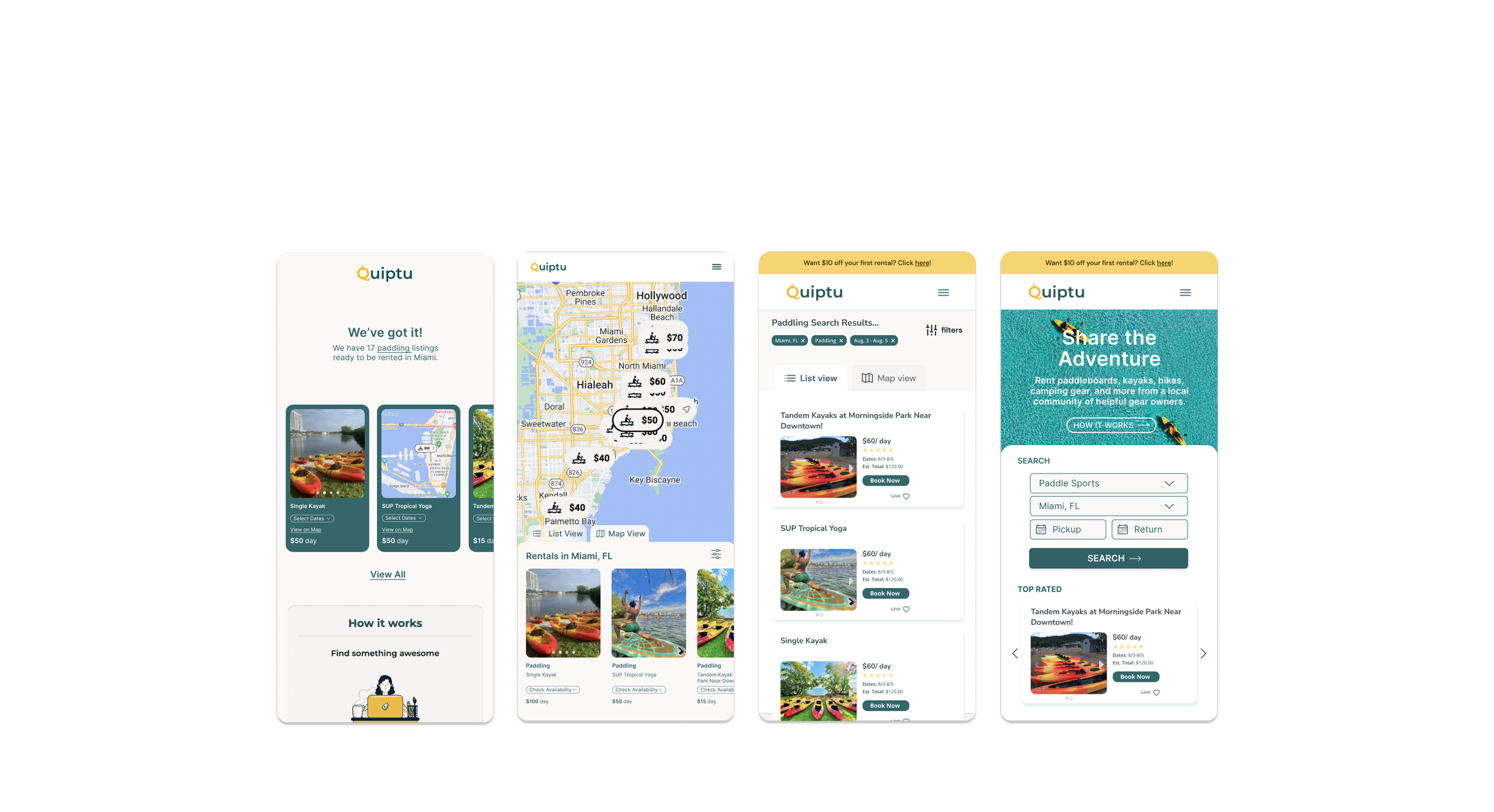
Combining the key features that performed best in testing, a final iteration of the Landing Page, Search Results Pages, and Home/Search Page were created.
Final mockups of the Landing Page, Search Results Pages, and Home/Search Page
05. RESULTS + LEARNINGS
Results
60% improvement in user trust + understanding with redesigned screens
Shorter user path between advertisement to search results/available rentals
Higher visibility of Quiptu’s gear rental process (“How it Works”)
Learnings
Prioritizing screens to redesign based on budget limitations
Working with web analytics on Hotjar to identify user behavior patterns (heatmaps, screen recordings)
Connecting analytics patterns to potential causes through interviews, testing, + heuristic analysis